Customizing Themes
Nokkvi comes with 23 built-in themes, but you can easily create your own using simple TOML files.
Built-in themes
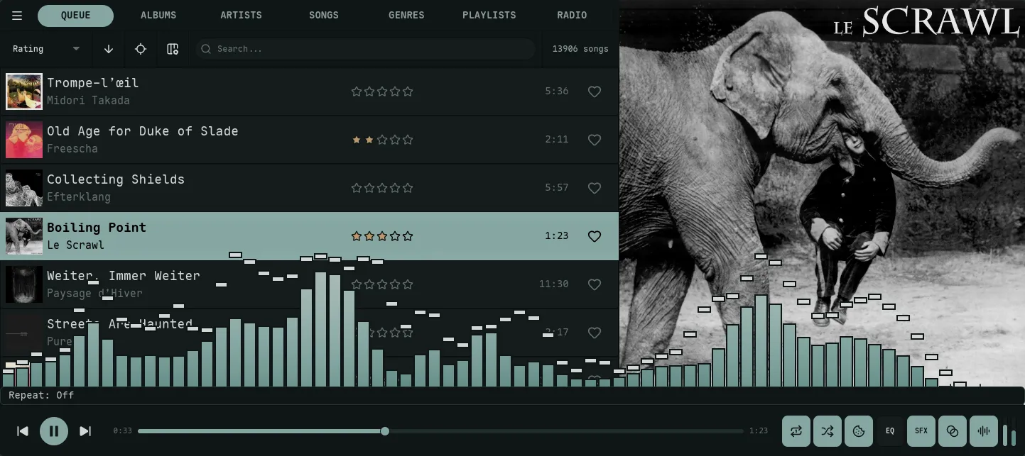
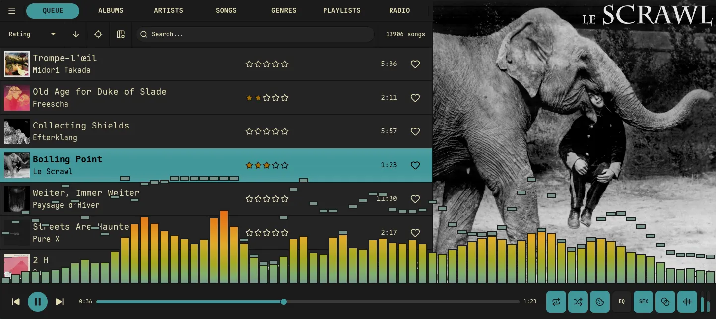
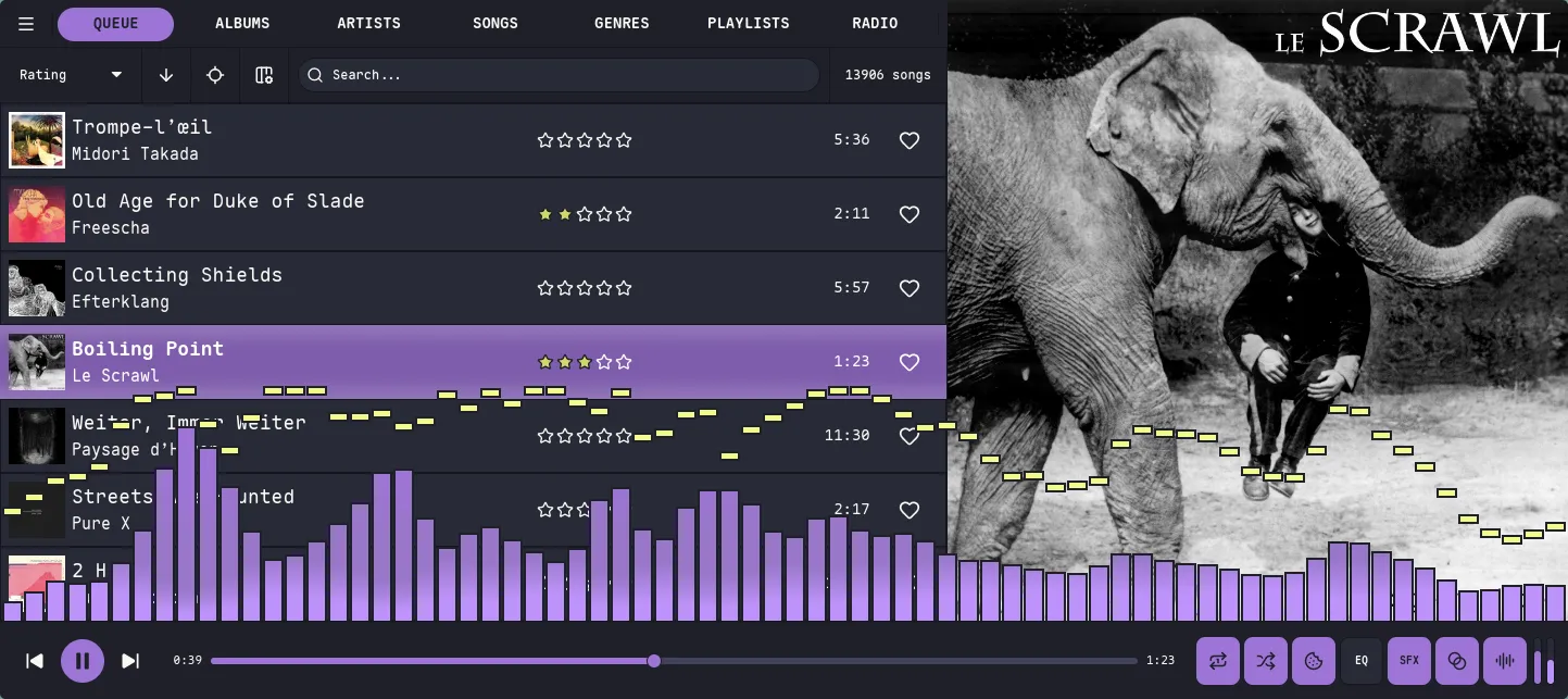
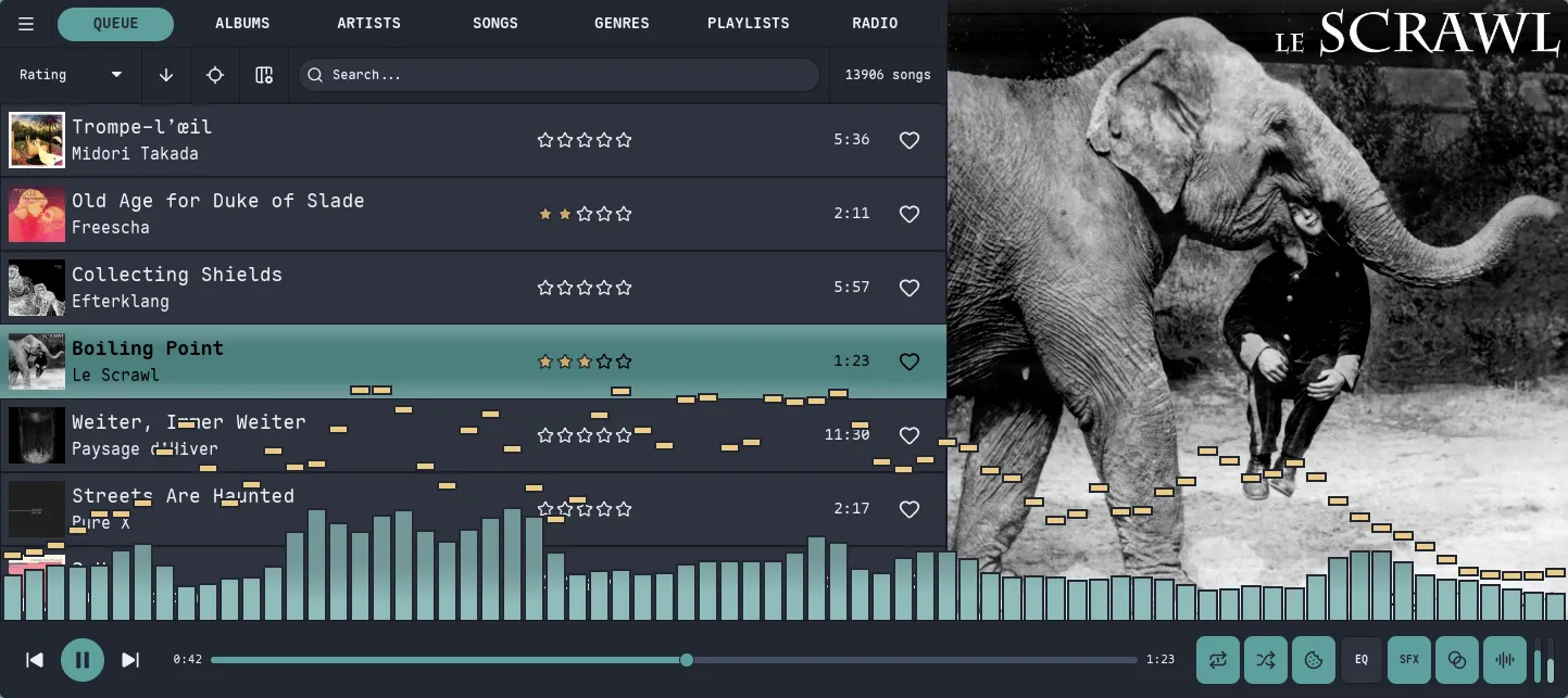
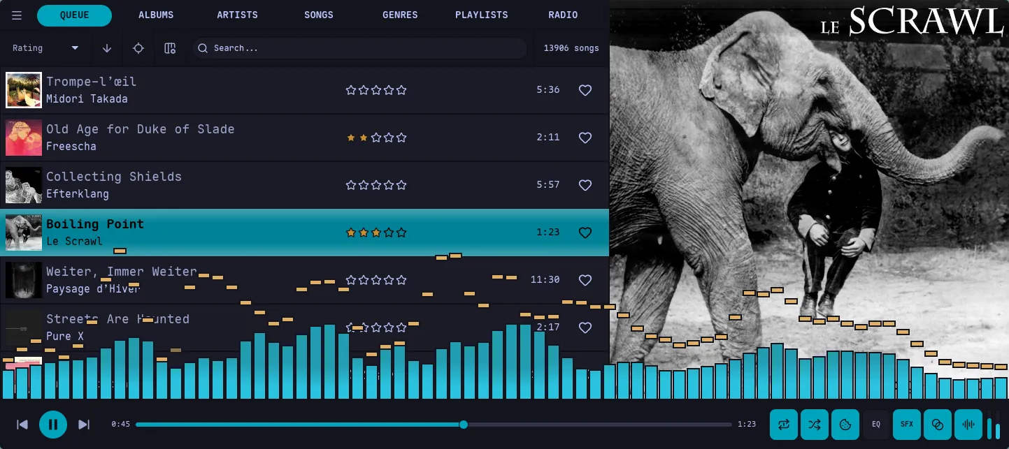
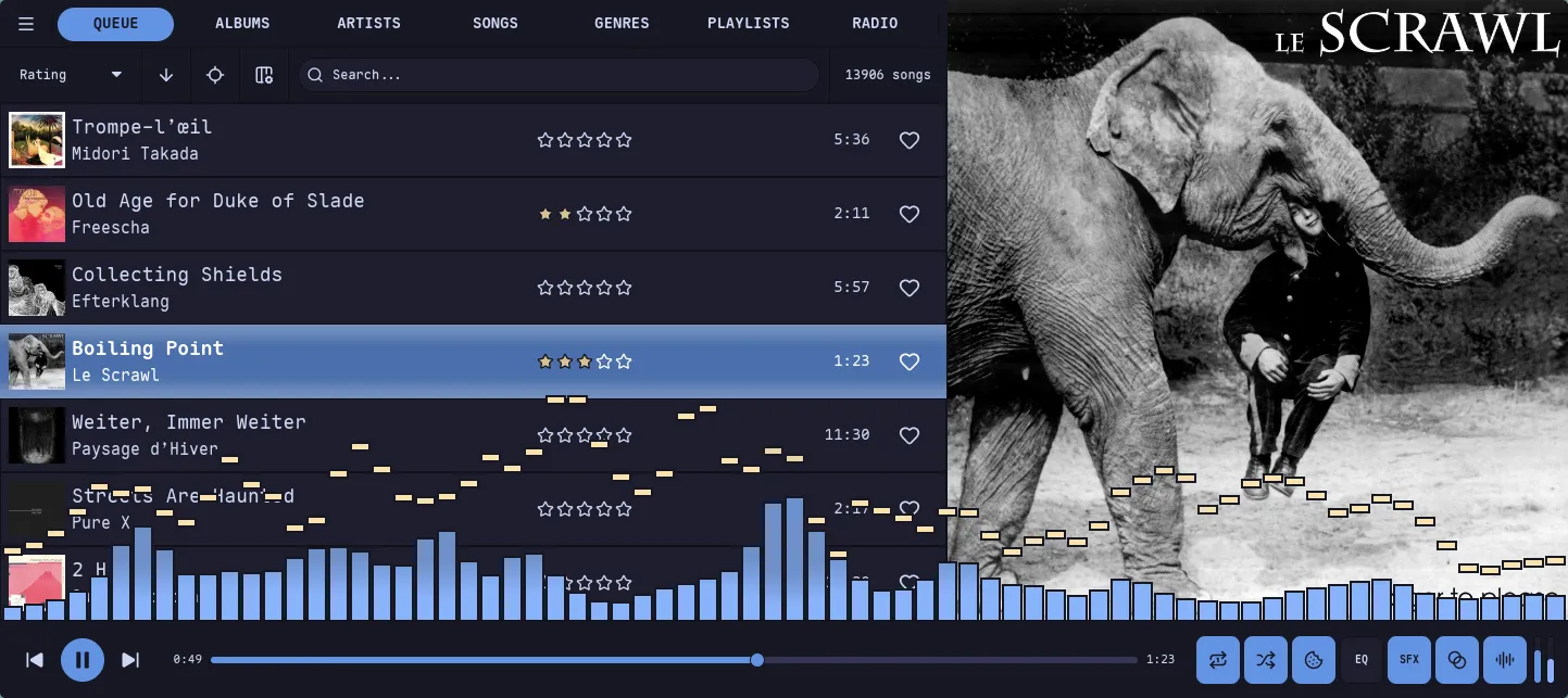
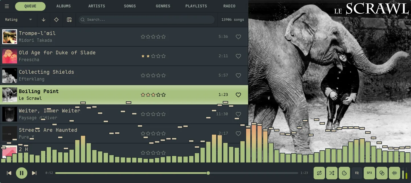
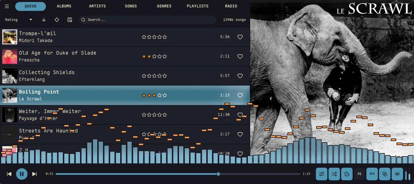
Section titled “Built-in themes”Switch themes from Settings → Theme → Browse Themes… (open Settings with the ` backtick). The picker is searchable and paints every row in its own palette, so scrolling the list is a live preview; press Enter or center-click a row to apply it. Here’s a sampler of the 23 built-ins — every frame is the same Queue view, so the only thing changing is the theme’s background, accent (the focused row + progress bar), text, and visualizer gradient.
Theme Location
Section titled “Theme Location”Custom themes are stored in:
~/.config/nokkvi/themes/Any .toml file placed in this directory will automatically appear in the theme picker (Settings → Theme → Browse Themes…). Built-in themes are seeded to this directory on first launch, so you can open any of them as a starting point. Fresh installs start on Svalbard (Nokkvi’s default theme); switch from the picker at any time.
Theme File Structure
Section titled “Theme File Structure”A theme file has a name field and two palette sections — [dark] and [light] — each containing the same color keys. This lets the same file drive both light and dark mode, toggled by the light_mode setting.
name = "My Theme"
[dark.background]hard    = "#1d2021"default = "#282828"# ...
[dark.foreground]bright = "#fbf1c7"# ...
[light.background]hard    = "#f9f5d7"default = "#fbf1c7"# ...
All keys have defaults. Both [dark] and [light] use the same underlying ThemePalette struct, and omitted fields fall back to the dark defaults — not to the light defaults shown below. So a partial [light] section can look surprisingly dark. For a clean light theme, set every light-side key explicitly; the Light columns in the tables below are the recommended values for a complete light palette.
Full Palette Reference
Section titled “Full Palette Reference”All color values are 6-digit hex strings ("#rrggbb").
[dark.background] / [light.background]
Section titled “[dark.background] / [light.background]”The background scale runs from darkest (hard) to lightest (level3). The UI layers components on this scale to create depth.
| Key | Dark default | Light default | Used for |
|---|---|---|---|
hard | #1d1d20 | #ffffff | Window chrome, outermost container |
default | #222226 | #fafafb | Main view background |
soft | #2e2e32 | #ebebed | Panel backgrounds, sidebar |
level1 | #2e2e32 | #ebebed | Slot row backgrounds |
level2 | #36363a | #deddda | Hovered row, secondary surfaces |
level3 | #3d3846 | #c0bfbc | Dividers, input borders |
[dark.foreground] / [light.foreground]
Section titled “[dark.foreground] / [light.foreground]”The foreground scale runs from brightest text to near-invisible muted text.
| Key | Dark default | Light default | Used for |
|---|---|---|---|
bright | #ffffff | #000000 | Primary text, titles |
level1 | #f6f5f4 | #241f31 | Standard body text |
level2 | #deddda | #3d3846 | Secondary text, metadata |
level3 | #c0bfbc | #5e5c64 | Tertiary text, timestamps |
level4 | #9a9996 | #77767b | Placeholder text, hints |
[dark.accent] / [light.accent]
Section titled “[dark.accent] / [light.accent]”Accent colors drive interactive elements — the progress bar, focused item, playing indicator, and link color.
| Key | Dark default | Light default | Used for |
|---|---|---|---|
primary | #3584e4 | #3584e4 | Default accent: progress bar, toggles, links |
bright | #62a0ea | #62a0ea | Hover state, brighter highlight |
border_light | #1c71d8 | #99c1f1 | Light border / glow around accent elements |
now_playing | #3584e4 | #1c71d8 | Legacy/round-trip-only: parsed but not consumed. The now-playing row fill is derived from primary and bright with a contrast guard; setting this key has no visible effect. |
selected | #3584e4 | #3584e4 | Legacy/round-trip-only: parsed but not consumed. The selected/center slot fill is derived from bright with a contrast guard; setting this key has no effect. |
border (top-level scalar)
Section titled “border (top-level scalar)”Unlike the other palette keys, border is a single hex string at the top level of each palette block — not a sub-table. It sets the color of chrome separators: the 1 px lines between nav-bar cells, list rows, header buttons, modal frames, and capsule outlines.
[dark]border = "#151515"
[light]border = "#c4bc9b"| Key | Dark default | Light default | Used for |
|---|---|---|---|
border | derived | derived | Chrome separators throughout the UI. When empty, derives from background.hard × 0.70. |
Set border as a top-level key under [dark] / [light] in the theme file (as shown above); omit it to fall back to the derived default.
[dark.danger] / [light.danger]
Section titled “[dark.danger] / [light.danger]”Used for error states, destructive action indicators, and conflict badges.
| Key | Dark default | Light default |
|---|---|---|
base | #e01b24 | #c01c28 |
bright | #f66151 | #ed333b |
[dark.success] / [light.success]
Section titled “[dark.success] / [light.success]”Used for enabled status indicators and success toasts.
| Key | Dark default | Light default |
|---|---|---|
base | #33d17a | #26a269 |
bright | #8ff0a4 | #33d17a |
[dark.warning] / [light.warning]
Section titled “[dark.warning] / [light.warning]”Used for warning toasts and capture prompts.
| Key | Dark default | Light default |
|---|---|---|
base | #f6d32d | #e5a50a |
bright | #f9f06b | #f6d32d |
[dark.star] / [light.star]
Section titled “[dark.star] / [light.star]”Used for star rating fills.
| Key | Dark default | Light default |
|---|---|---|
base | #f6d32d | #e5a50a |
bright | #f9f06b | #f6d32d |
Visualizer Colors
Section titled “Visualizer Colors”Each mode ([dark.visualizer] / [light.visualizer]) has its own set of visualizer colors. See the Visualizer Reference for how gradient_mode maps these onto bars and lines.
| Key | Dark default | Light default | Description |
|---|---|---|---|
border_color | #1d1d20 | #ffffff | Bar border / LED segment gap color |
border_opacity | 1.0 | 0.0 | Bar border opacity (0.0 to 1.0) |
led_border_opacity | 1.0 | 0.0 | Border opacity in LED bar mode |
bar_gradient_colors | ["#3584e4", "#1c71d8", "#62a0ea"] | — | 1–8 hex colors used for the bar gradient |
peak_gradient_colors | ["#ed333b", "#ff7800", "#f6d32d"] | — | 1–8 hex colors used for peak indicators |
[dark.visualizer]border_color = "#1d2021"border_opacity = 1.0led_border_opacity = 0.8bar_gradient_colors = ["#b8bb26", "#98971a", "#d8a657"]peak_gradient_colors = ["#fb4934", "#fabd2f"]Minimal Example
Section titled “Minimal Example”You don’t need to specify every key — omitted fields use the dark defaults shown in the tables above (one exception: border derives from background.hard × 0.70 rather than copying a hex default). Here’s a theme that only changes the accent color:
name = "Cobalt Accent"
[dark.accent]primary      = "#0088cc"bright       = "#33aaee"border_light = "#005f99"
[light.accent]primary      = "#0077bb"bright       = "#0088cc"border_light = "#005f99"
Full Example
Section titled “Full Example”A complete theme file with all sections filled out:
name = "Example Theme"
[dark]border = "#151515"
[dark.background]hard    = "#1d2021"default = "#282828"soft    = "#32302f"level1  = "#3c3836"level2  = "#504945"level3  = "#665c54"
[dark.foreground]bright = "#fbf1c7"level1 = "#ebdbb2"level2 = "#d5c4a1"level3 = "#bdae93"level4 = "#a89984"
[dark.accent]primary      = "#458588"bright       = "#83a598"border_light = "#689d6a"
[dark.danger]base   = "#cc241d"bright = "#fb4934"
[dark.success]base   = "#98971a"bright = "#b8bb26"
[dark.warning]base   = "#d79921"bright = "#fabd2f"
[dark.star]base   = "#d79921"bright = "#fabd2f"
[dark.visualizer]border_color        = "#1d2021"border_opacity      = 1.0led_border_opacity  = 0.8bar_gradient_colors = ["#b8bb26", "#fabd2f", "#83a598"]peak_gradient_colors = ["#fb4934", "#fabd2f"]
[light]border = "#c4bc9b"
[light.background]hard    = "#f9f5d7"default = "#fbf1c7"soft    = "#f2e5bc"level1  = "#ebdbb2"level2  = "#d5c4a1"level3  = "#bdae93"
[light.foreground]bright = "#282828"level1 = "#3c3836"level2 = "#504945"level3 = "#665c54"level4 = "#7c6f64"
[light.accent]primary      = "#076678"bright       = "#458588"border_light = "#83a598"
[light.danger]base   = "#9d0006"bright = "#cc241d"
[light.success]base   = "#79740e"bright = "#98971a"
[light.warning]base   = "#b57614"bright = "#d79921"
[light.star]base   = "#b57614"bright = "#d79921"
[light.visualizer]border_color        = "#fbf1c7"border_opacity      = 0.0led_border_opacity  = 0.0bar_gradient_colors = ["#458588", "#076678", "#83a598"]peak_gradient_colors = ["#cc241d", "#d79921"]